Raise, Workplace Management Platform
The evolving nature of workplaces has made it increasingly challenging to make informed real estate decisions. Many conventional real estate companies continue to rely on outdated business practices and technology, lacking the ability to provide up-to-date information that can assist clients in their decision-making. Raise, on the other hand, provides clients with high-level support from top workplace professionals, brokers, and project managers, all powered by a groundbreaking end-to-end real estate management platform.

Workplace Mgmt
Market Analytics
Lease Details
Space Metrics
Functions
UX/UI Design
Design System
Roles
Figma
Jira
Tools
May - July 2022
Timeframe
Intro
When I began redesigning the mobile experience for Raise, I realized that several features from the desktop version were not going to work well on mobile. The platform was complicated, cluttered, and confusing. I aimed to simplify and prioritize the app's essential functionalities. Inputs from users, product, and engineering teams aided in identifying the critical functions and information that needed refining, removal or improvement.

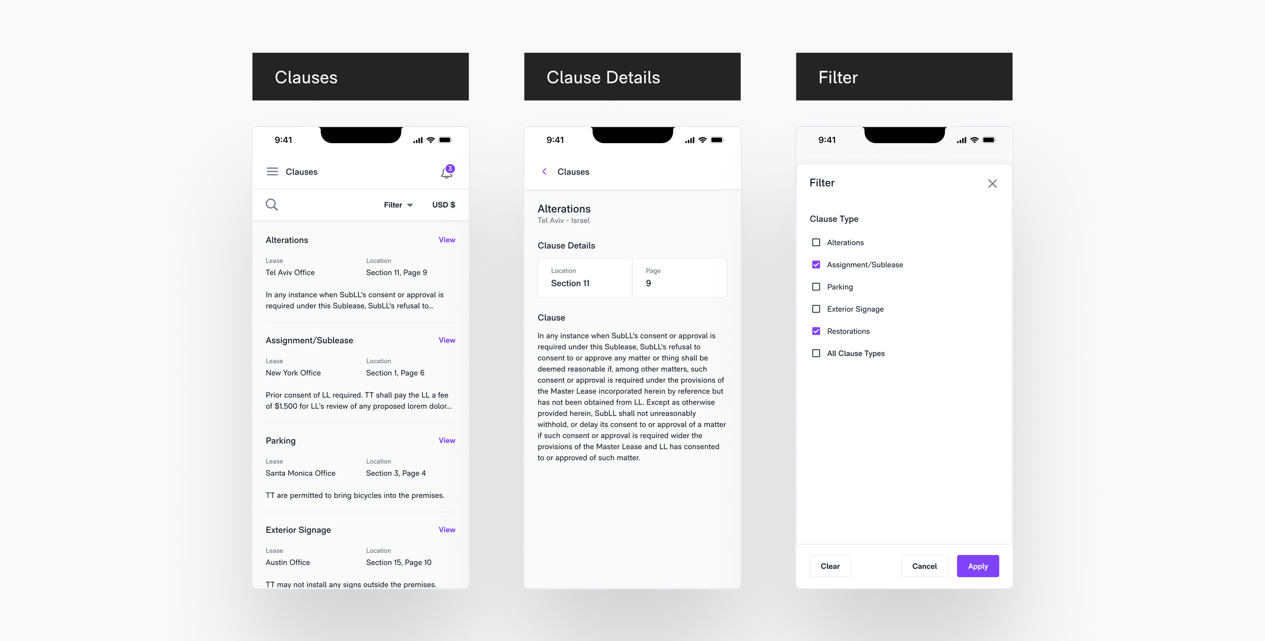
Listings, Clauses & Tours
Regarding the Listings section, the users – the agents, wished to share, archive, add, and delete multiple listings at a time in order to maintain client dashboards. To solve this issue, I introduced a new multi-selection flow inspired by something we check almost everyday, our email inbox.

In regards to Clauses, I improved overall scannability by reorganizing and truncating the clause descriptions to a maximum of two lines of text. The entire description is now displayed on a secondary page – Clause Details
Rent Schedule
The platform had rent data available for leases, but it lacked any sort of visual representation. To improve the user experience, I created a line chart to provide a clear and intuitive way to view data for multiple offices at once. Additionally, a floating action was added to give users the ability to switch between the table and chart views. The uppermost section of the Rent Schedule primary section summarizes overall rent, remaining rent, free rent, and expenses for all offices, providing users with a comprehensive overview of office data.


Critical Dates & Office Utilization
Here is a group of some other miscellaneous screens that I designed to fit the mobile experience. To streamline the display of Critical Dates, I simplified the list to show only the Event type, Lease, and Location, with the date/due date at the top of the hierarchy. To draw attention to upcoming critical dates, I incorporated color-coded tags to guide user focus. The Lease Details screen provides a quick overview of the space, including a map, floor-plan, and other essential details. The Office Utilization screen enables users to track how the office space is being utilized by employees.

Design System
As part of my responsibilities for building the new design system, I undertook the task of designing text inputs. Below, on the left-hand side, you can see all the variations of the current platform. During the process, I discovered several inconsistencies, such as varying text types, interactive states, sizes, corner radius, and border color.
Next →